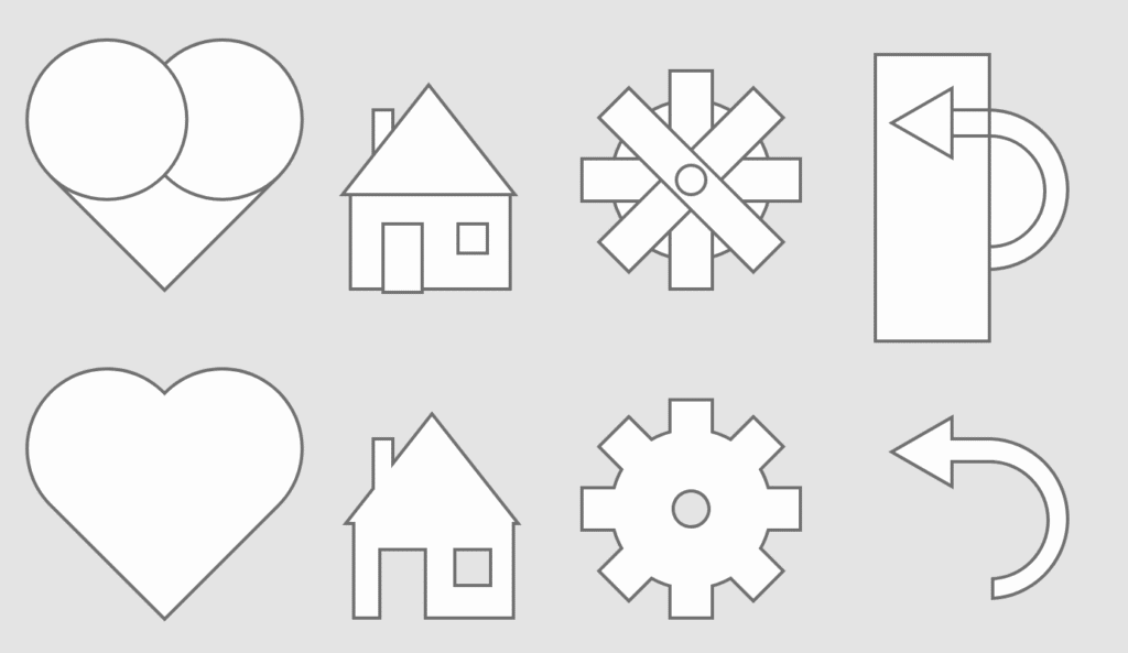
Sometimes we need more complicated shapes than circles, squares and polygons. The Pathfinder panel allows us to create new shapes by adding and subtracting them together.
To use the Pathfinder Panel we need to select both objects by using the selection while holding shift.
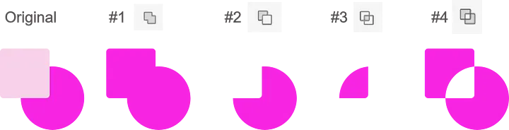
The pathfinder tool has the following functions:
#1 Add: Combines the selected objects together
#2 Subtract: Slices the top object out of the bottom
#3 Intersect: Creates a new object from the overlapping area of both objects.
#4 Exclude Overlap: Cuts out the overlapping area of both objects.
Creating new shapes using the Pathfinder panel
Below we will learn how to make a simple heart shape with the Pathfinder Panel.
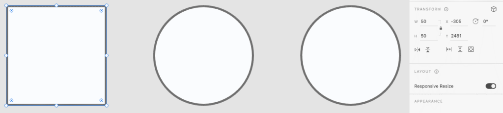
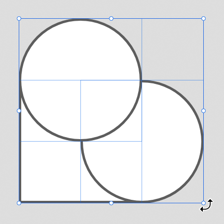
To start, create a square and two circles. Use the Transform panel on the right to ensure all three objects have the same height and width.
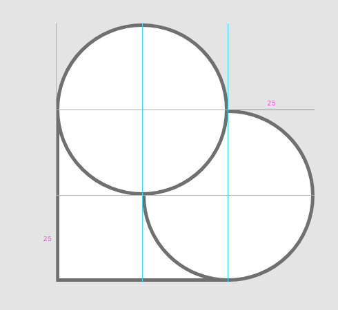
Drag the circles over two edges of the square. Use the guides to help you line everything up perfectly.
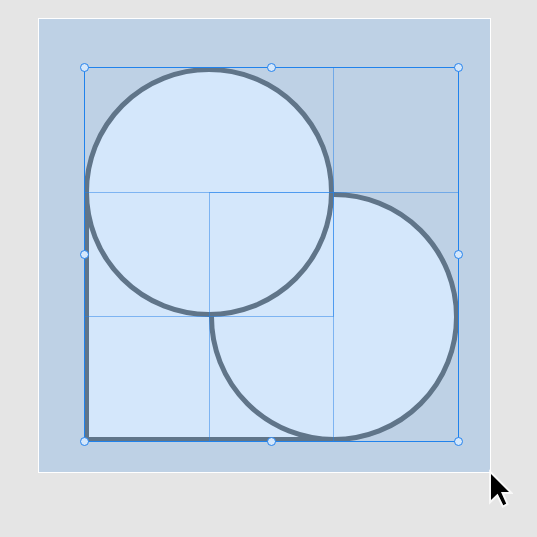
Drag select all 3 objects.
Hover your mouse just outside of one of the selection box’s corners to make the rotation tool visible. Rotate your heart so it is upright.
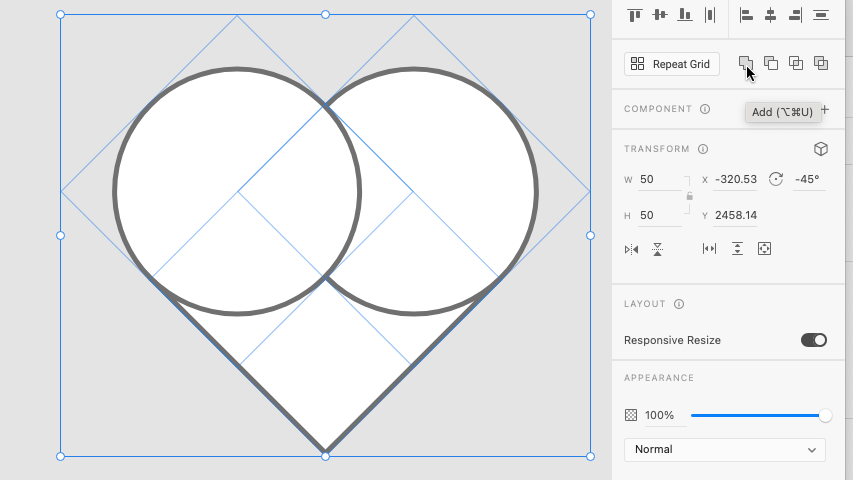
Press add in the Pathfinder Panel.
Your heart should now be complete. Try to think of other ways you can use the Pathfinder panel to create new shapes.
Please focus on your apps minimum viable product first
After we have created our apps basic functionality we can add and change elements to refine it. This polish can be the difference between our app appearing to be created by an amateur or professional.
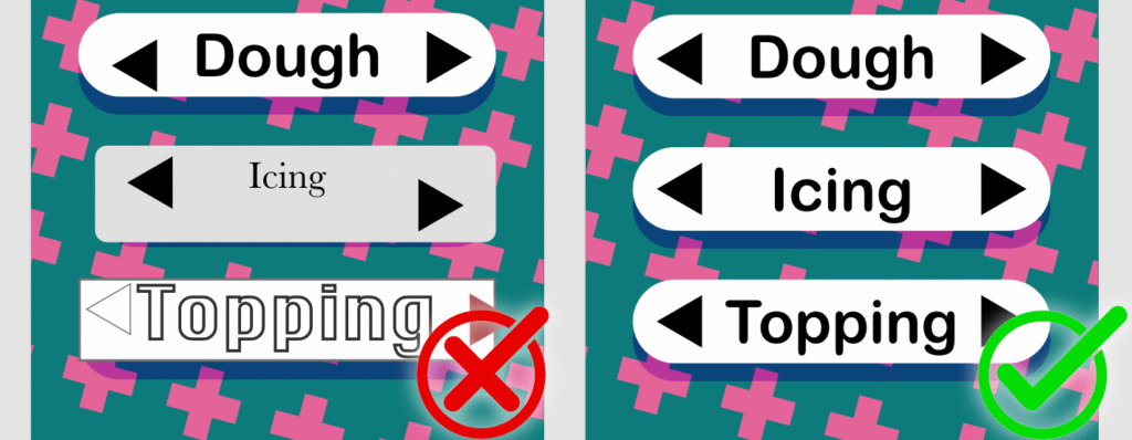
Visual Constancy
Do these two characters look like they belong together? Probably not! That’s because they have very different art styles, which can make your work look messy and confusing.
When styles don’t match, it’s harder for people to understand what’s going on, and it doesn’t look as good. Try to keep things looking similar. For example, if you’re using photos, keep using photos, or if you start with 3D characters, don’t mix in hand-drawn ones.
Good design looks better and is easier to use when things match.
In the first example, the words are different sizes, the fonts don’t match, and the buttons are all shaped differently. This makes it look messy and harder to follow. In the second example, everything is the same size, the fonts match, and the buttons all look the same. When things are consistent like this, the design looks neater and is easier to understand.
Colours
In the example above, there are too many bright colours fighting for attention, which makes it hard to know where to look and can even give people a headache.
When you use fewer colours that work well together, your design feels calm, organized, and more professional. It also makes important things stand out without overwhelming the viewer. Remember that good design helps people find information quickly, and a limited colour palette makes that easier.
Animation
A splash screen is the fist screen users see before using an app, even before the home screen. This type of screen is used to capture the users attention and to get them excited to use the app.
If we want to add a little bit of style to our app we can include some basic animation.
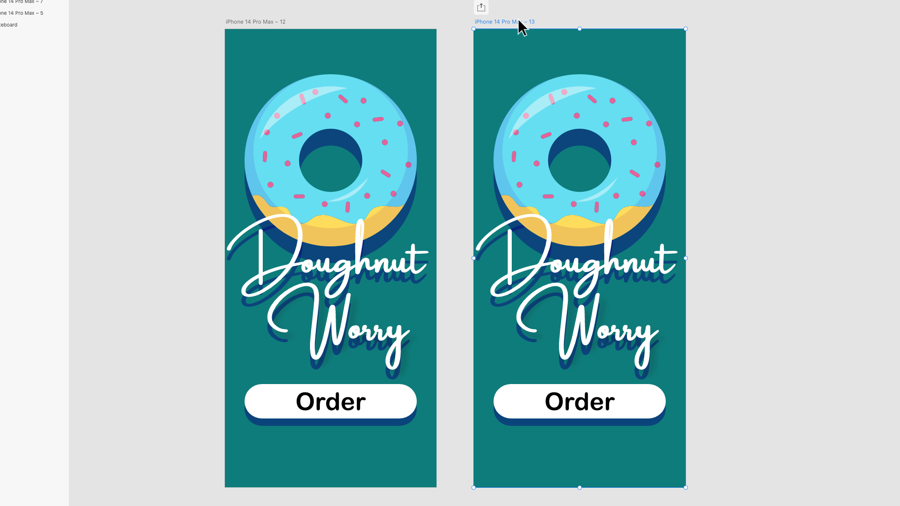
Bellow, will I show you how to make a simple splash screen
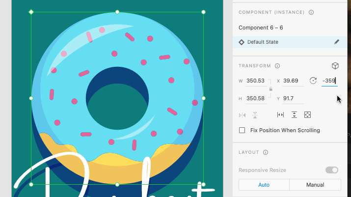
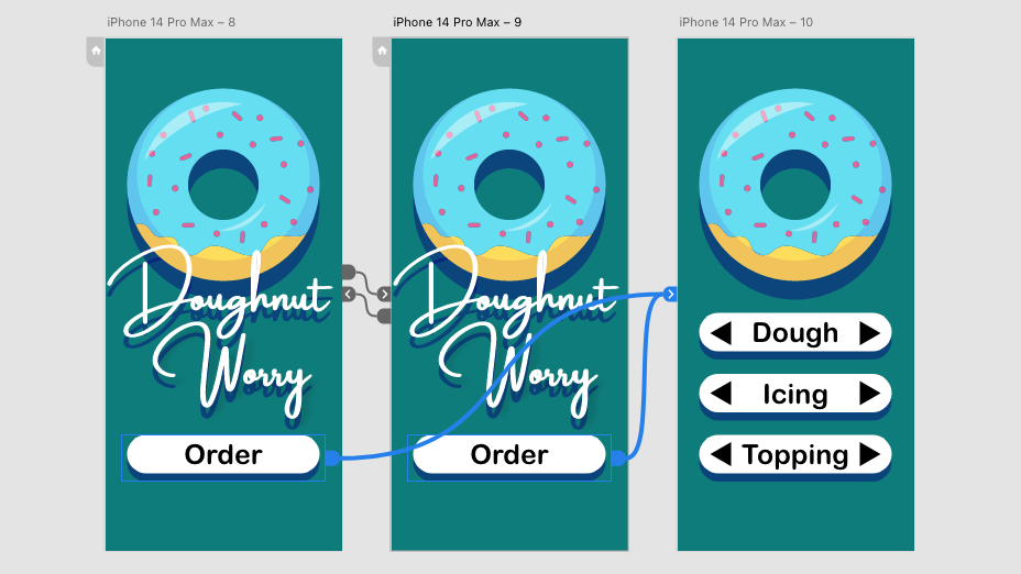
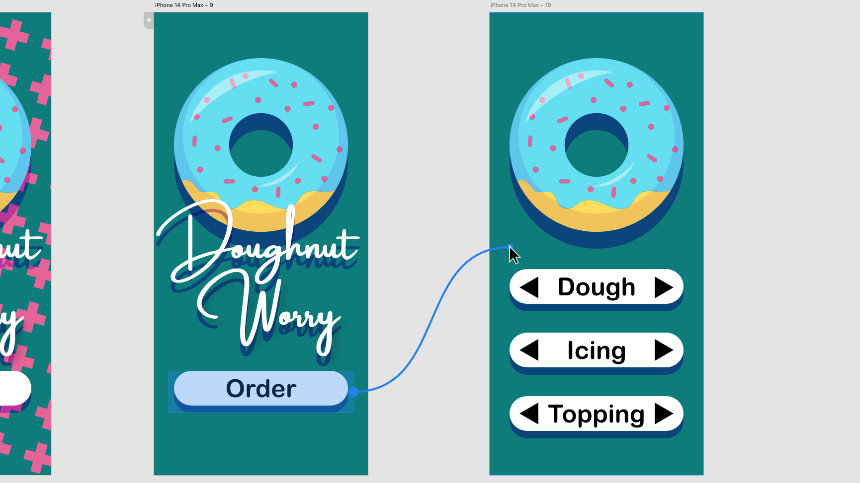
Here we are going to add a simple rotation animation to the doughnut. This kind of animation works best with round elements that don’t have parts sticking out. This object could be a wheel, ripples in a cup of coffee, or in this case, a doughnut.
Start by designing a splash screen and making a copy of it by grabbing the artboard title (This is usually called iPhone 14 Pro Max”) and dragging off a new one while holding alt/option.
On the second screen while in the Design menu, change the rotation of our round element to 359 degrees. While it may not appear a lot has changed, this is an important step in making our object spin.
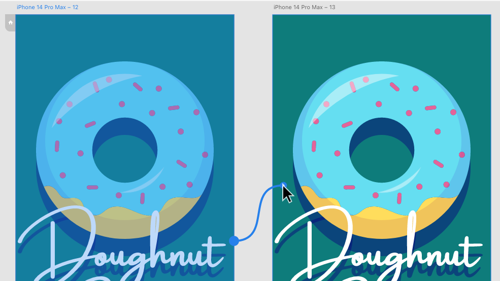
Head to the Prototype menu.
In the Prototype menu, select the title of the first splash screen and drag a wire over to the second screen.
After connecting the wire head over to the Interaction panel on the right.
Change the trigger to time with a delay of zero seconds, this makes the animation begin right away.
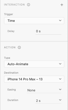
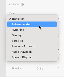
in the Action panel, change the animation type to “Auto-Animate”, the Easing to “None”, and the Duration to “2 seconds”. This will make the object rotate at an even speed. You might want to experiment with these settings later.
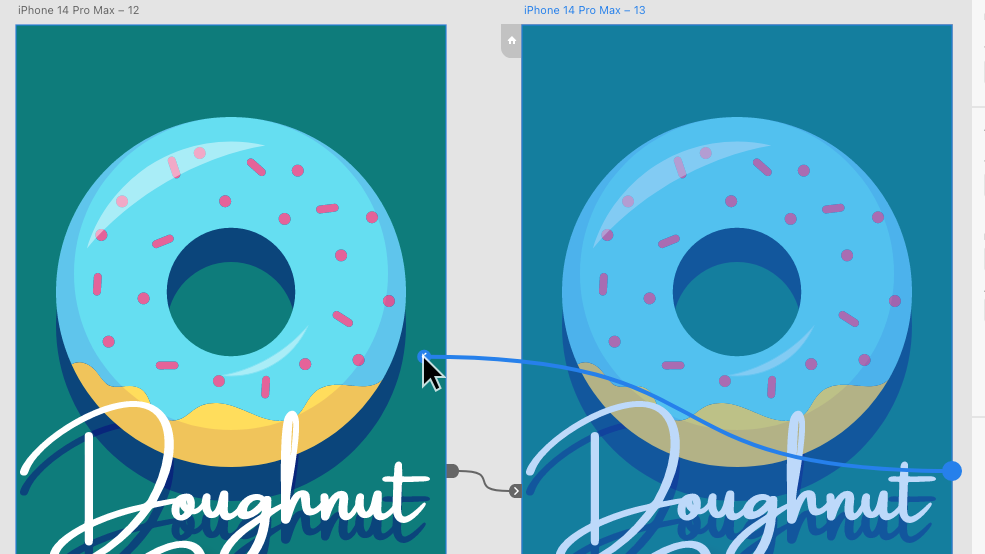
Now select the title of the second splash screen artboard and drag a wire over to the first.
Head back to the Interaction and Action panels.
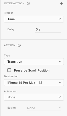
Here, change the animation type to “transition”. While you are here, ensure there is no delay and animation is set to “None”.
You can text if you have successfully created your splash screen animation by pressing play in the top right corner. If successful, the animation should loop forever.
Finally, we need to connect the splash screen to the home screen. Be sure to connect the buttons on both splash screens as show above to ensure it is always accessible.
This is just one of many ways we can use animation to add a premium feeling to our app. Experiment with the skills you have learnt to see if you can create new types of animations.
By now you should be ready to create additional screens for your app. These screens are called artboards.
The best way to do this is by duplicating the existing art board. This ensures the new artboard is the same size, this is important because phone screens cannot change size.
Duplicating Artboards
To duplicate the artboard, we need to use the selection tool to select the title of the artboard (This is probably called something like “iPhone 14 Pro Max”). After selecting, we can duplicate the window two ways; by pressing cmd+d or by dragging the artboard by the title while holding alt/option.
After duplicating the artboard we can delete the unneeded elements and continue working.
Creating Buttons
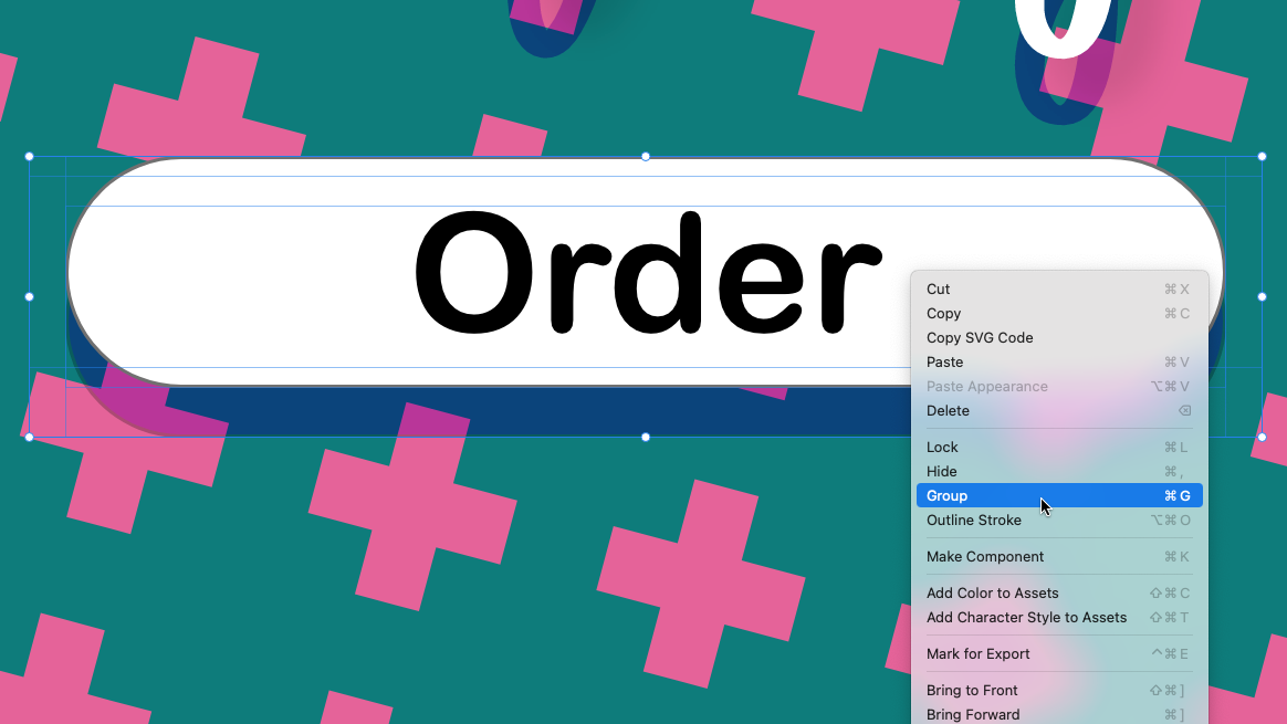
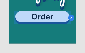
Before we create our transitions we need a button to press to activate it. These buttons can be a shape, image, text or be any type of object.
If our button is made of multiple objects we can group them together using the select tool to select multiple objects while holding shift. We can then right-click the selection and choose group, or press cmd+g. The group of objects selected will now be treated as one object.
The Prototype Menu
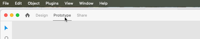
Up until this point we have been using the Design menu to define the visual aesthetic of our app, we now need to move to the Protoype menu in the top left corner to create our transitions.
To create a transition, use the select tool to select your button. You will notice a blue arrow on the right side of the object.
You can now drag this arrow to the artboard you want your button to link to and unclick. After releasing, you will notice a connection between the button and artboard – these connections are called wires.
You can now test your buttons by clicking the play button in the top right corner of the screen. You may need to click the artboard that has your button in it first to start in the right place.
Types of Transitions
With your now linked button selected you might notice the action menu on the right side of the screen. Here you can change the type of transition that will happen when the button is pressed.
Maybe you want everything to move into place with Auto-Animate or for the new screen to fade in over the old one with Overlay.
Experiment with the different types to see what effects can be done!
Now that we have gotten a general idea of our layout with our wireframe, it is time to add some visuals to our app.
Colour Palette
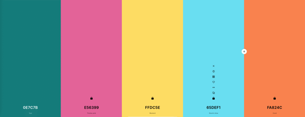
nearly every major app has a distinct colour palette: Youtube is red, white, and black while Snapchat is yellow, blue and white. to strengthen the appearance of our app we can also choose a colour palette for our apps.
As a quick way to generate a colour palette I recommend using Coolors.co. Here we can generate colour palettes by pressing spacebar until we get one we like.
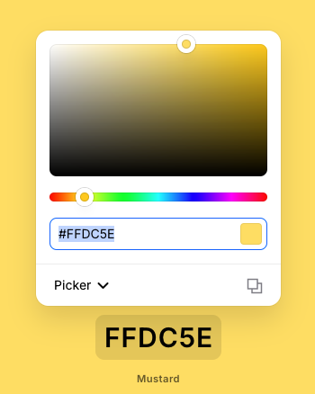
Once we are happy with the colour palette, we can copy the individual colours by clicking the codes at the bottom and using cmd+c. This is called a Hexcode which turns the exact colour into numbers and letters.
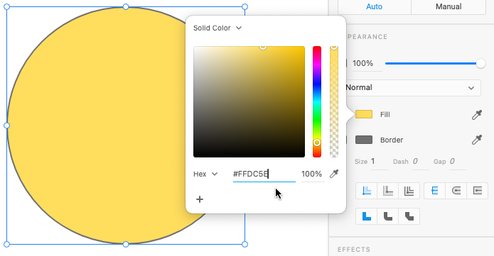
We can now make an object in our Adobe Xd document this colour by selecting it, clicking the colour block next to “fill” or “border” and pressing cmd+v.
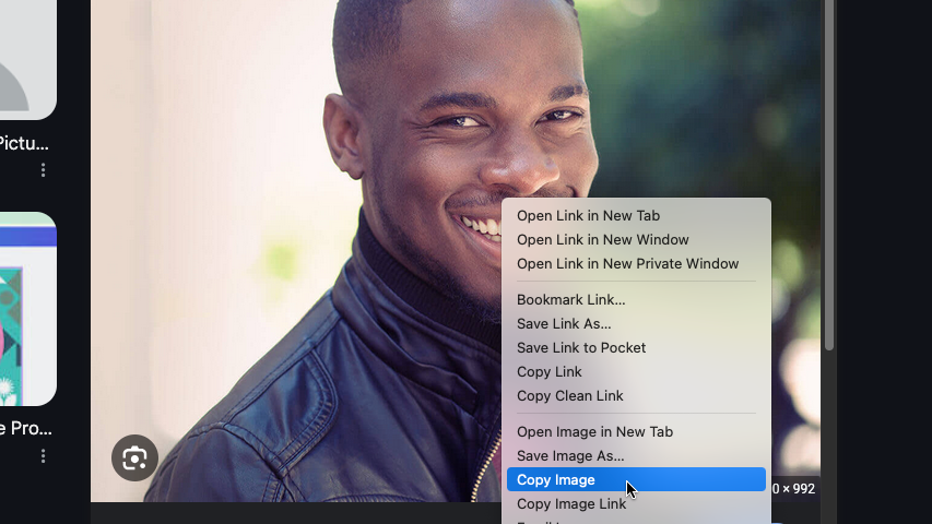
Inserting Images
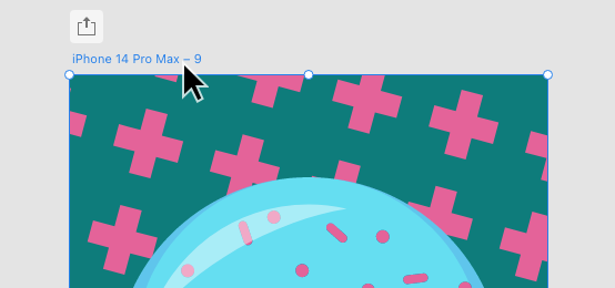
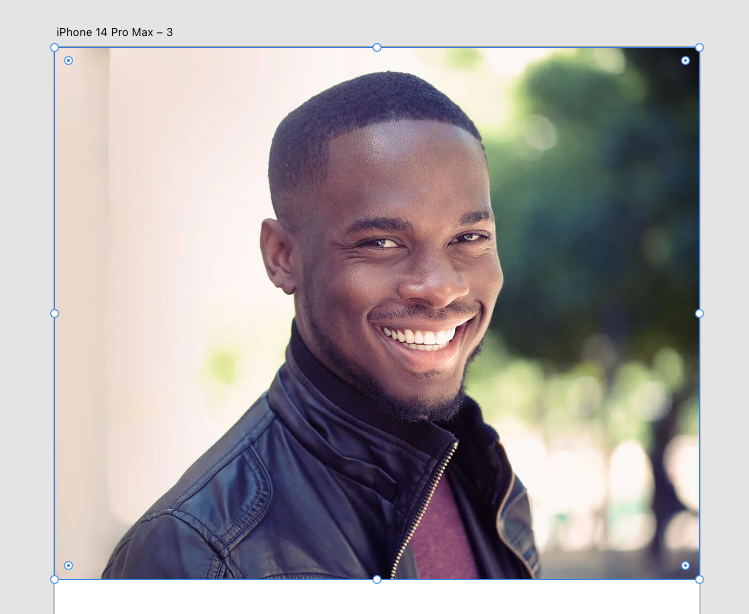
Rather than creating every image in our app from scratch, we can use online images from places such as Google Images. When we find and image we like we can copy the image by right-clicking and selecting Copy Image.
We can then insert the image into Adobe Xd with cmd+v.
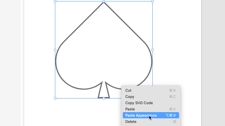
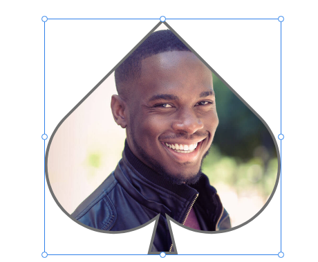
We can also use a shape to mask our image by right-clicking and selecting Paste Appearance.
We can change the appearance of other elements in our app using the following panels:
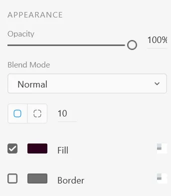
Appearance Panel
Here you can change the fill colour, border colour and roundness of object corners.
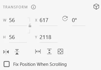
Transform Panel
Allows the height, width, angle and position of the objects to be changed.
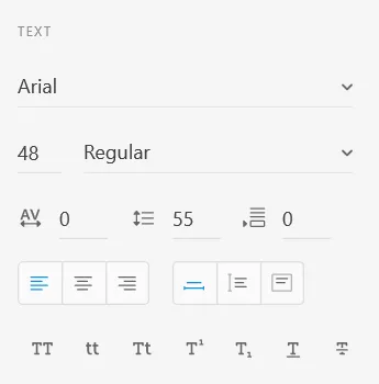
Text Panel
Here you can modify font type, size, text alignment, and other text options.
Use this tool to select, move and resize objects (shapes, lines and text boxes).
Select multiple objects by holding Shift while selecting. Copy an object by dragging while holding Alt/Opt.
Click and drag to draw a rectangle. Hold Shift to create a square.
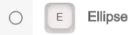
Click and drag to draw an ellipse. Hold the Shift key to create a perfectly round circle.
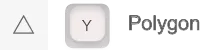
Click and drag to draw a triangle. Hold the Shift key to create a equilateral triangle. Use the Up and Down keys while dragging to change the number of sides, creating other shapes like diamonds, pentagons, and hexagons.
Draws straight lines. Hold Shift to draw perfectly straight lines at 90 and 45 degree angles.
Creates a text box.
Alignment Panel
Use these tools to align multiple objects. You can select multiple objects by holding shift while using the select tool.
You can find this panel in the top right corner of the window.
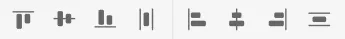
Align Up/Down/Left/Right
Aligns all selected objects to the desired side. See align bottom example below
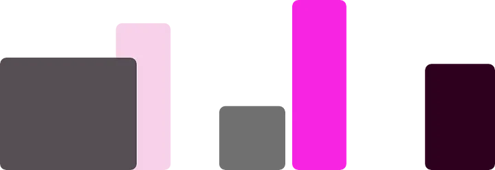
Align Center
Aligns the centers of the selected objects on the chosen axis. See example bellow.
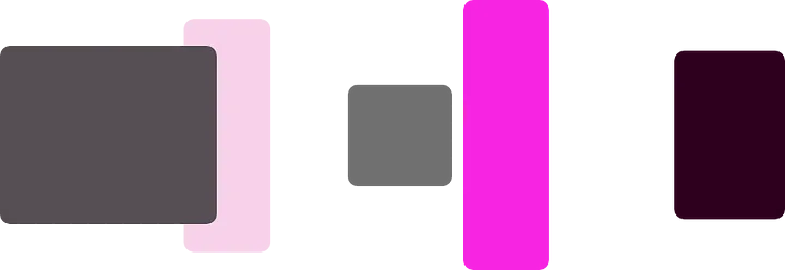
Distribute
Evenly spaces objects along the chosen axis. See example below
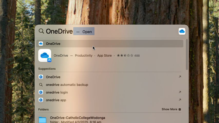
Press Command + Spacebar, type “OneDrive” and select the top result or press Enter.
Follow the on screen prompts using your school email login details.
Be sure to allow access to “Documents” and “Desktop” when asked.
If you denied access to documents
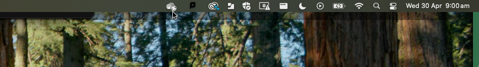
If you accidentally denied OneDrive access to your Desktop and Documents folders, you can restore this by clicking the OneDrive icon in the top-right corner of the screen.
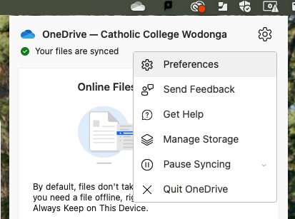
Click the Settings icon in the top-right corner of the window and click Preferences.
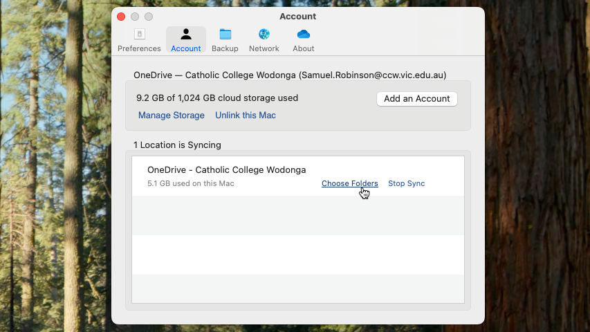
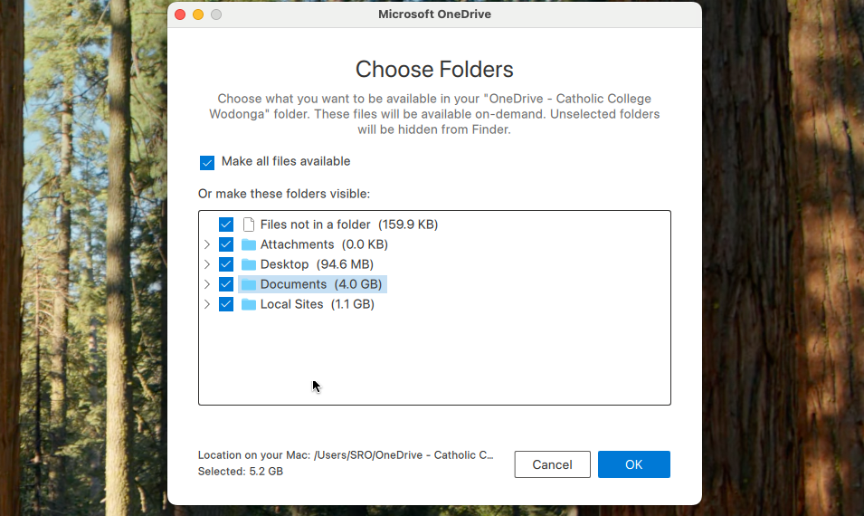
In the Account Tab, click “Choose Folders“
In the Choose Folders menu, ensure that “Desktop” and “Documents” are checked and press OK.
Install Adobe XD on your personal MacBook:
Press Command + Spacebar on your MacBook, type “Self Service”, and press Enter.
In the Self Service application, search for “Creative Cloud” and proceed with the download.
Once Creative Cloud is installed, open it by pressing Command + Spacebar, typing “Creative Cloud”, and pressing Enter.
Scroll down to find Adobe XD under the heading “More apps from Adobe” to install.
To activate AdobeXD use your school login information.